


The Silent Comedy is a San Diego-based rock band, known for their folk, Rock and Roll and Americana-inspired music. The new album "Enemies Multiply" represents a significant shift in The Silent Comedy sound and attitude.
Brand Goals – Along with the shift in tone, the band was entering a new visual chapter. Looking to pair high-contrast, black and white, photography with graphic elements.
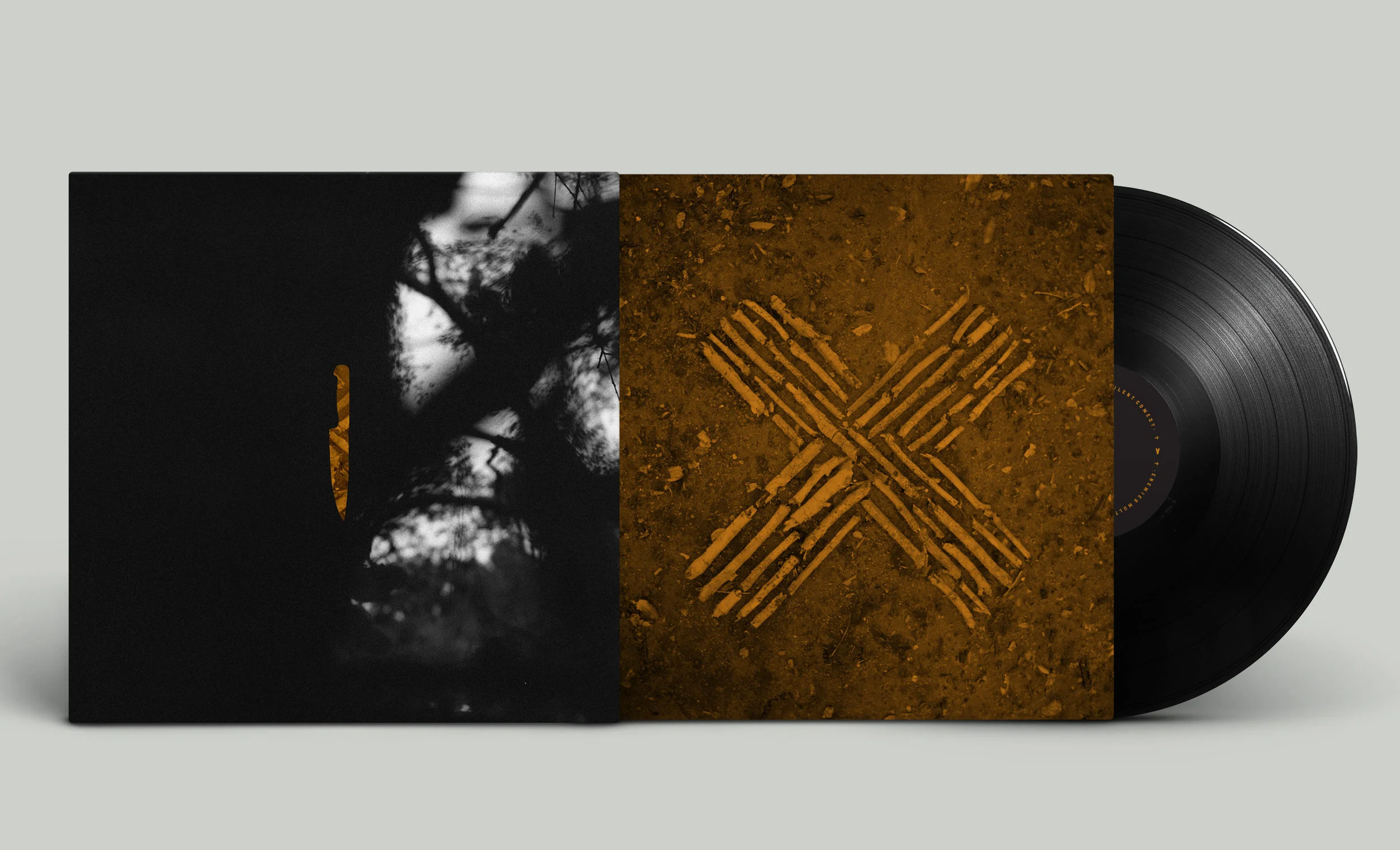
One through-line that should remain from the past visual history of the band, is some element of roughness. Whether in the grittiness of the photography, the feeling of the typography or some “hand-made” aspect.
Primary Album Logo Mark – The use of typography and minimal graphics allowed the mark to have a simple, yet strong visual with the knives and “M” intersecting as one.
Album Brand Emblem – Inspired by various elements from a film reel and religious symbolism.
Album Cover – Die cut knife revealing the sleeve design and record insert.
Album Back – Crest design with poster insert.
Inside Album – Die cut circles revealing vinyl sleeve and poster.
Poster – Insert front and back design with full album lyrics.
Tour Poster
Tour Poster
Single Promotional Design